ShareFile
Identity and digital experience for the magic of everyday flow.
ShareFile is a fast-growing business that began with a product that made sharing and signing digital documents easy and secure. In 2011, this caught the eye of Citrix, which acquired the company for its portfolio of collaboration tools. After over a decade, ShareFile decoupled from Citrix, giving it the opportunity to tell a story of evolved focus: from file-sharing to the human elements of a modern client experience. The brand we developed to tell this new story would put people at the center.
Every element of the brand system and experience would underscore the ease with which ShareFile helps customers — and their clients — do their best work by simplifying communication, smoothing collaboration, and automating repetitive tasks.
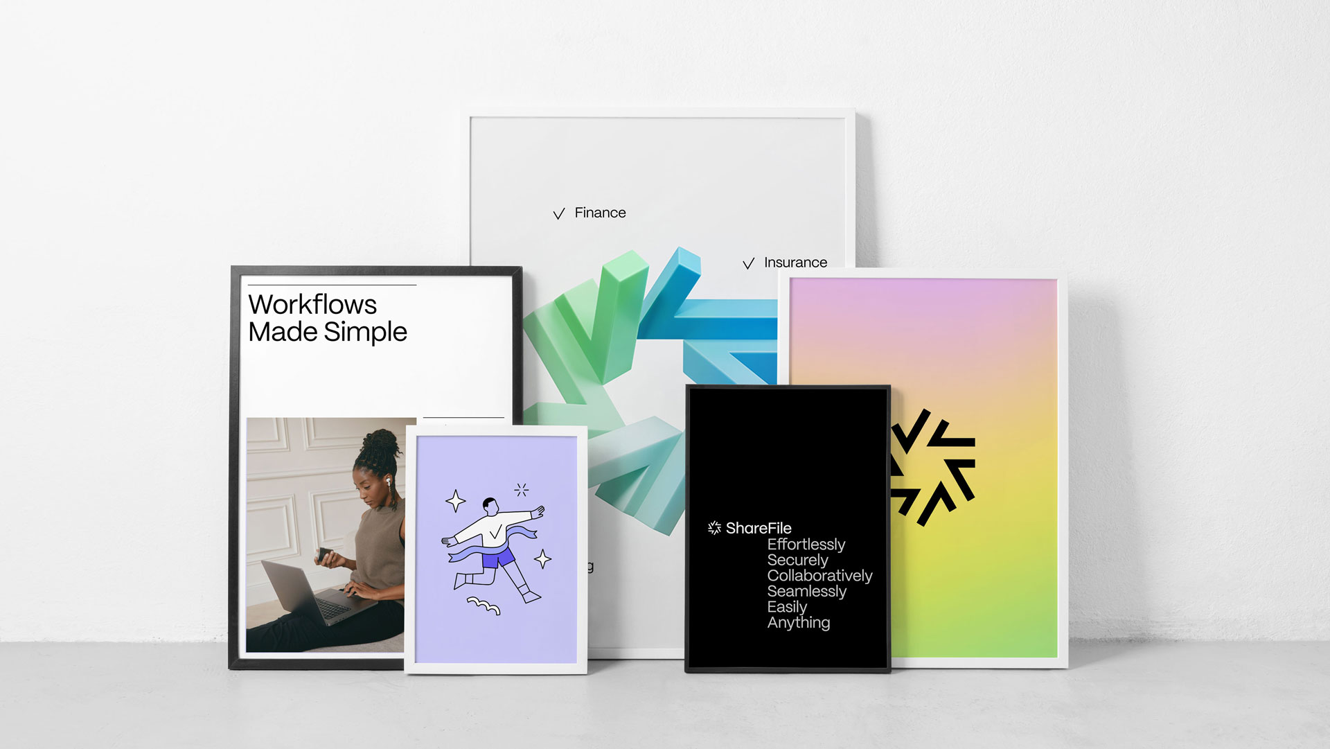
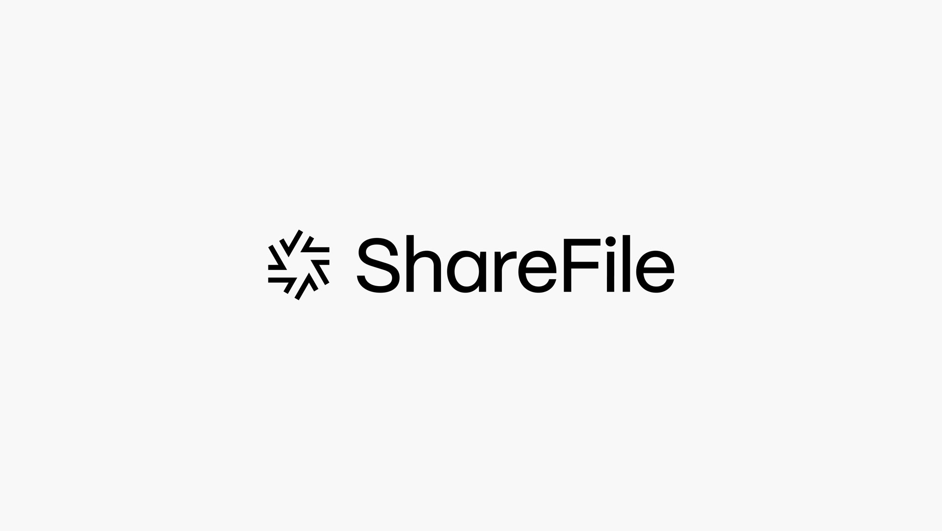
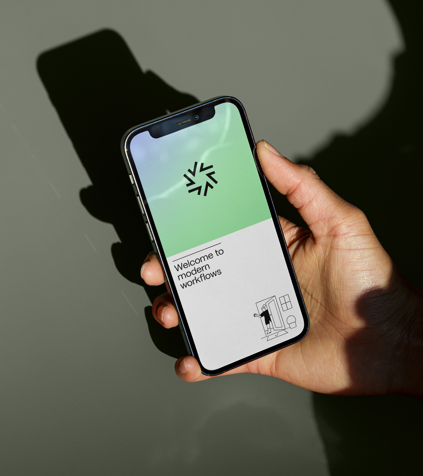
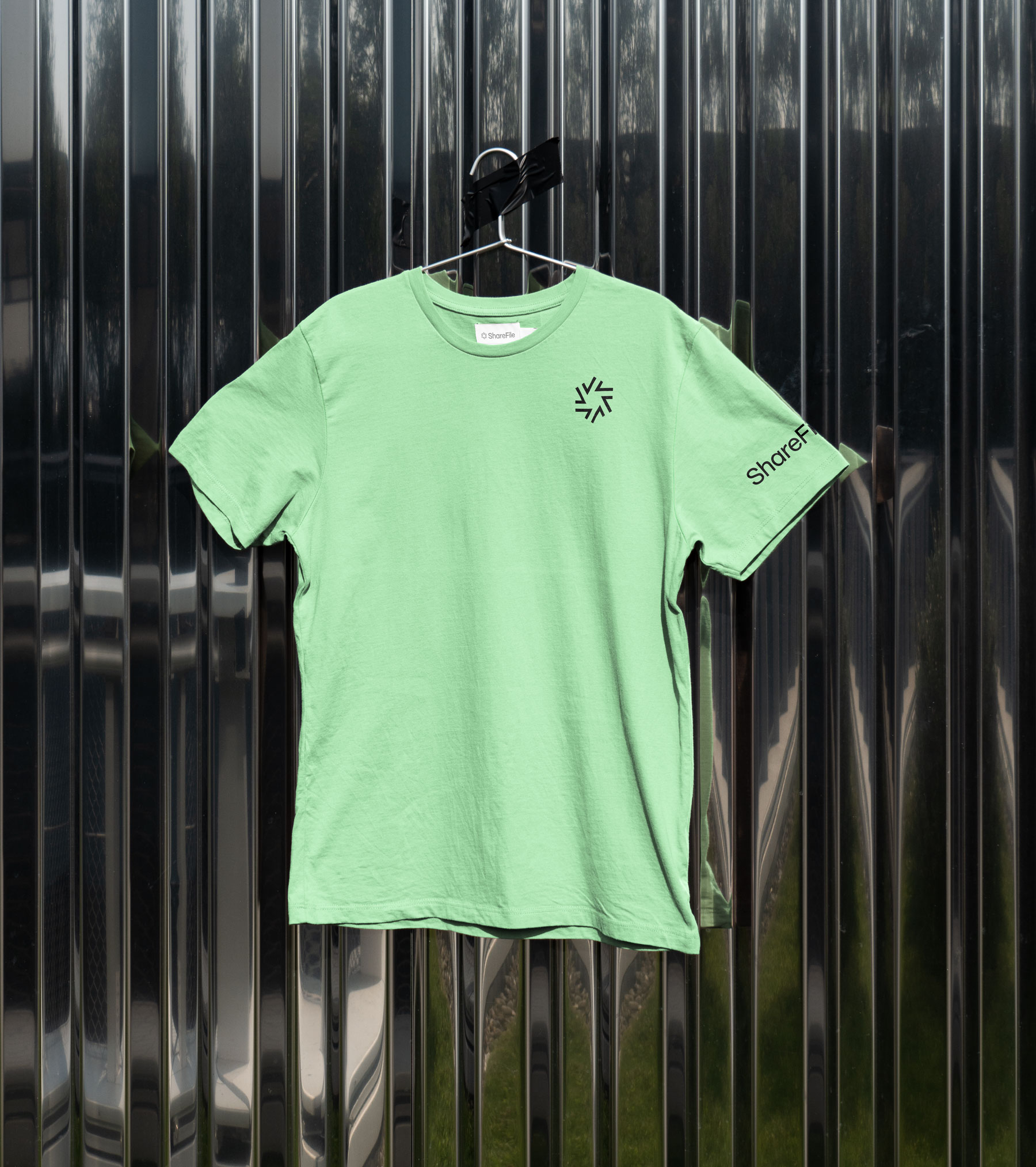
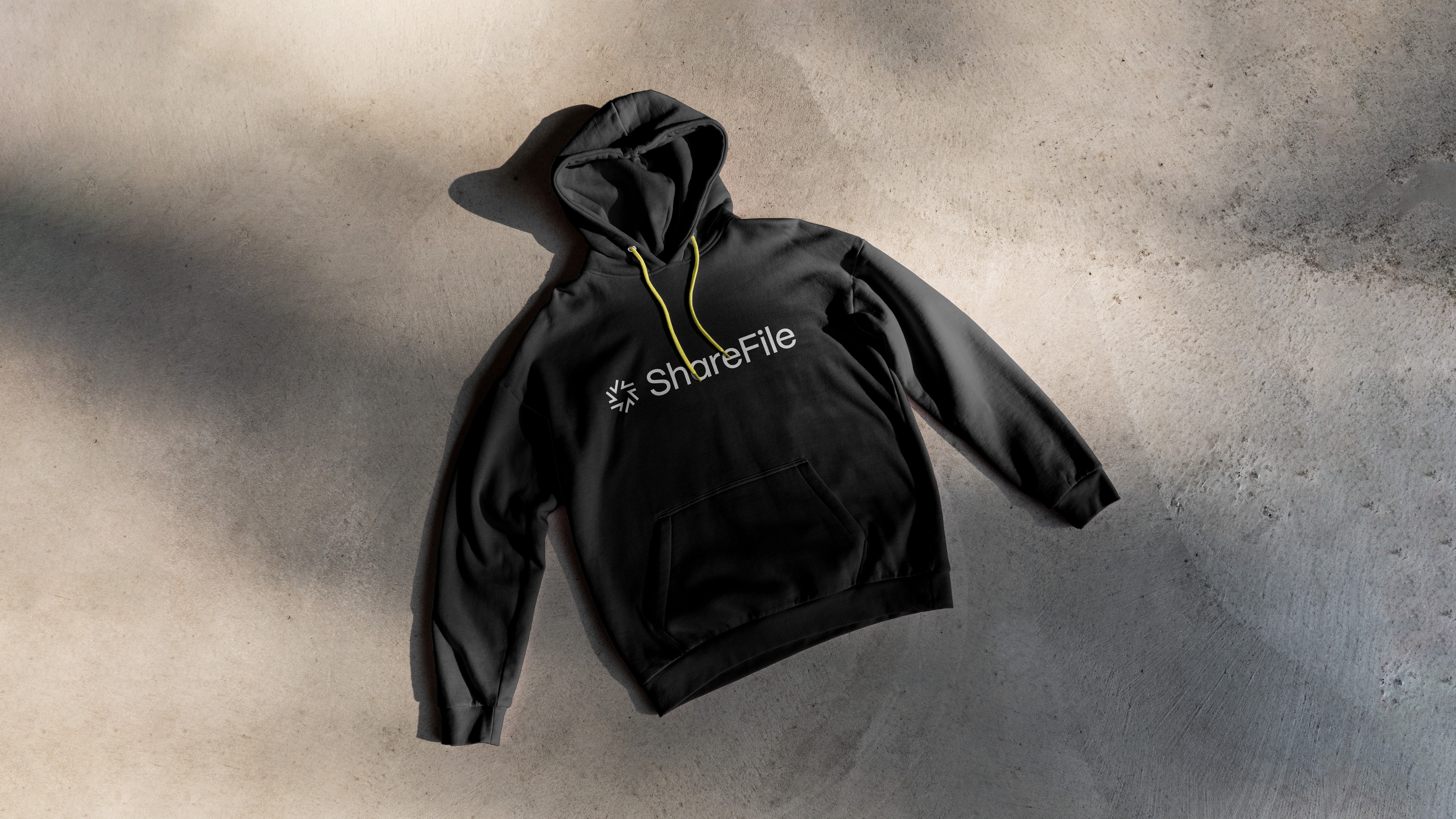
To tell a story of forward motion, of flow, and the joy of completing one task after another, we developed a logomark composed of checkmarks. Each individual check comes to life in a variety of ways, animating into a vibrant star or flywheel. Combined with our full wordmark, it makes for a dynamic pairing.
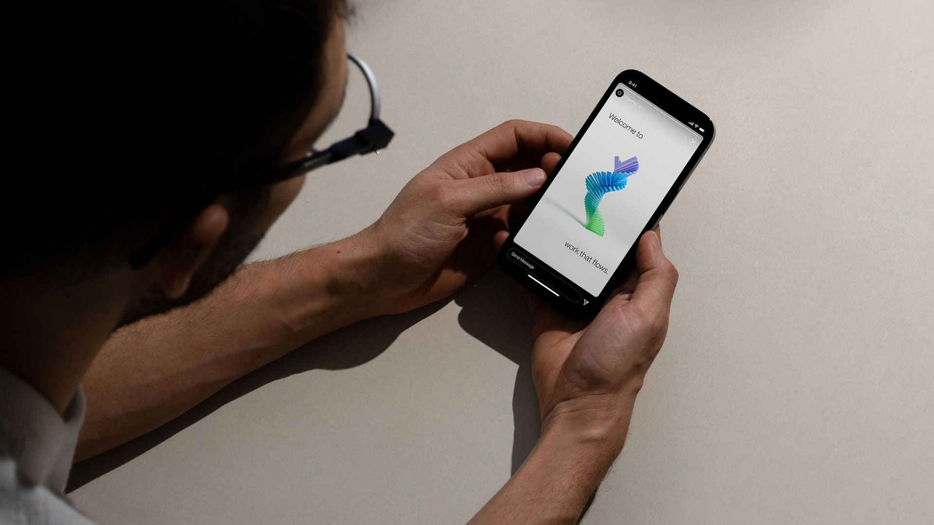
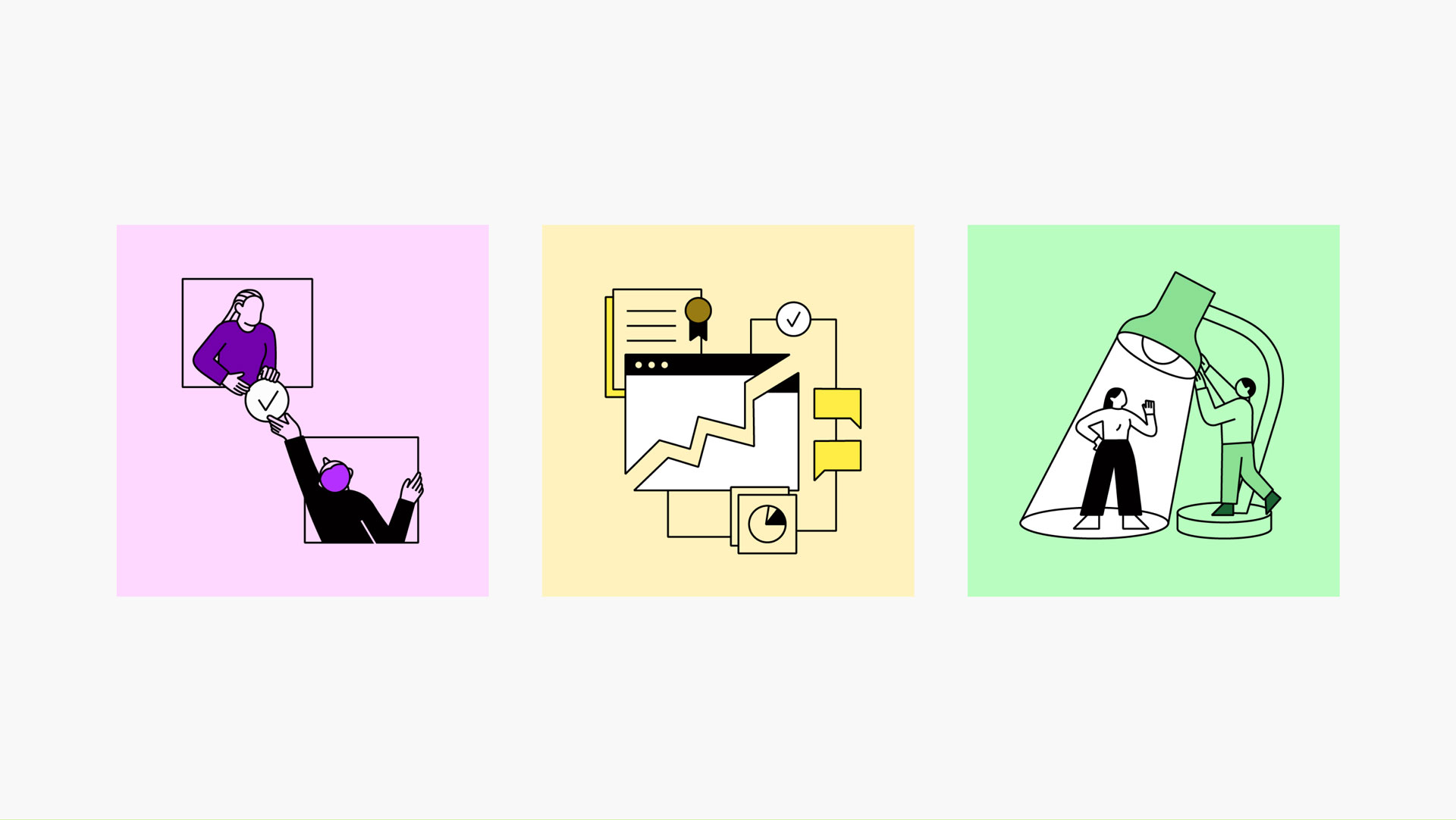
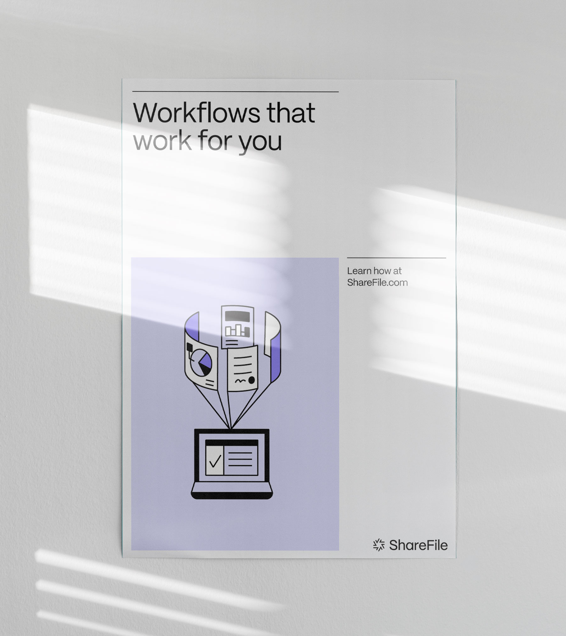
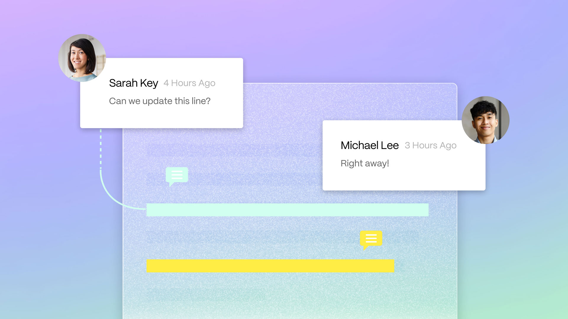
The brand system uses a varied taxonomy of assets and media for a textured, engaging experience. Animated shapes in abstract, 3D planes evoke flow and ease, while warm portraiture of people in homey working environments paint an authentic portrait of contemporary work life. Spot illustrations are used to dramatize key value propositions and add playfulness and humor to the whole of the system.
During this project I had the role of designer at Athletics. I was part of our design sprints, presentations of works, and worked as the continuity between the design and external development team.
This project was featured in Brand New, Creative Boom, Graphic Design USA, and Visual Journal.
